Widgets Libraries vs Masters vs Styles
30th September 2013
There are three ways of controlling and applying design across a project in Axure; widget libraries, masters and styles. How these features are used in concert is source of some debate.
Today we're going to go through a practical example of combining these features to create an customisable call-to-action button, which you can re-label across multiple pages whilst maintaining control of key attributes with a combination of masters and styles. We're also going to use a widget library to manage our new button design, because we're working with the assumption that you're a power user and we want to use it across all your projects. We're going to find out some of the foibles of maintaining these aspects between an .RPLIB widget library file and project specific RP files.
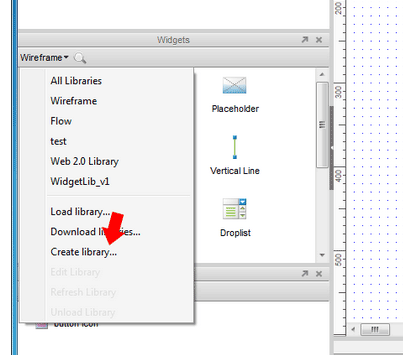
First we going to create our own widget library. Go ahead and create a new widget library file by selecting create library from the wireframe. pane, and choosing a name and location for your file:
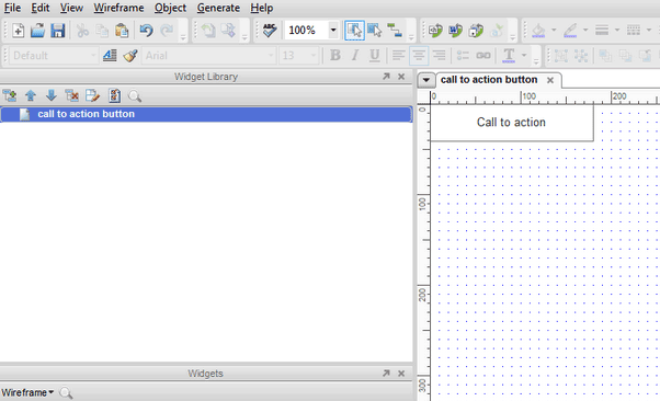
Now we have an RPLIB file open. Rename the default widget (which appear where pages usually appear), e.g. 'call to action button' and double click it to open it. Now, the experience here is a lot like using a standard RP file - this can be a little disconcerting.
Now we want to drag out a rectangle shape from the default wireframe widget library, (a widget library within a widget library?! My brain is combusting!) Add a generic label, like 'Call to action' because we will want to be able to change this label across different pages. Note this element is not a master, because we will want to vary the width of the element depending on the size of the label. Your screen should look something like this:
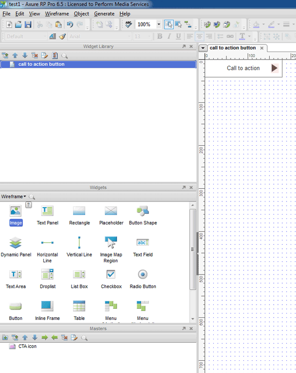
Next we will create an icon for our button. Now, we want this icon to be consistent across all of our buttons, so it should be a master. Select 'Add master' from the Masters pane. New Master 1 will appear in the pane. Let's rename it to 'CTA icon', then open it. Drag out an image file, and double click the placeholder to open your file browser, and add an image file.
Now close the Master tab to return to the Call to action button widget. Drag out your new master and place it in the appropriate place, like so:
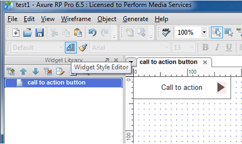
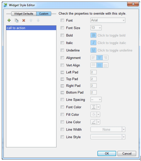
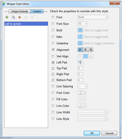
Now we have a custom widget, with a master embedded within in. Now what we want is some control over the appearance of the widget, we achieve this using Styles. Using Styles rather than Masters, is often better when the contents of a Widget are variable, such as in the case of this button, where the label may change between pages. So let's open our Widget Style Editor:
Select the custom tab, and click the add icon, to add a new custom style. Let's name it something like 'call to action':
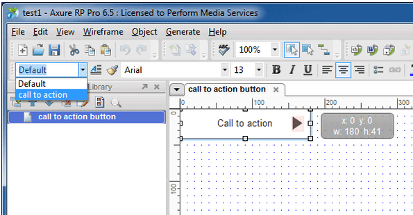
Click OK. Now we need to apply the Style to our widget. Click the rectangle shape, then select our new style from the Style dropdown:
Now we save our Widget Library file in the normal way.
Go back to our RP file, and import our widget library using the same Widget pane menu we used earlier to create our library. Our library loads, with our new widget in the widget library pane. Drag it out onto the page.
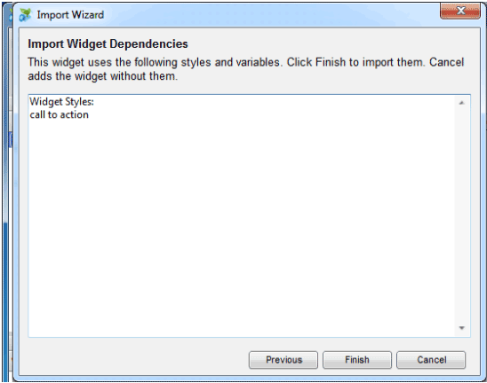
Axure helpfully warns you that you are about to import a Style you used in your widget library. Click finish to import it.
You may notice something else - the master you embedded in your widget appears in the Masters pane. Useful huh. You can distribute your widget, and still control your CTA icon from this location. (Just remember that your widget library is a separate file, and updates in your RP won't feed back to your RPLIB ).
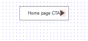
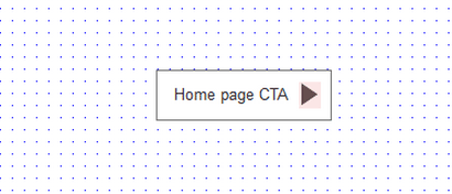
So, let's rename our button on the home page. Let's call it 'home page CTA'. Let's go create some more instances of our button on other pages, open another page, drag out a button, add the label 'Internal Page CTA'. Do the same for another page. Call it 'Contact page CTA'. Now let's also resize the buttons so we don't have lots of odd white space...
So. did you notice my on-purpose-mistake?
The alignment of the widget is centralised, hence the lettering going over the icon.
So, let's fix it - align left, done. Right? Well no. We want to effect change across all of our buttons, and work with reusable assets - let's go back to our widget library file - saving our RP first.
We want to edit our custom style, so open the Widget Style Editor. Select our custom style. Check the alignment option, ensuring it is set to left aligned. Our button still isn't right - it needs some padding. Check Left Pad, and add 15px. Click OK:
Our widget looks better in our RPLIB. Save the file, and open the RP again.
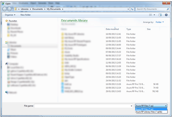
Now, you'll notice the widgets don't auto update. Under the Widget pane menu you can find a refresh item. Unfortunately though, this doesn't do what you might expect. Both styles and masters that are used in RPLIB files are not updated with this command. Instead you need to use the import from RP from the file menu. Go ahead and select this from the file menu.
Something that caught me out here is that from the dialogue that follows you will need to also specify that you want to select an RPLIB file, in 6.5 this dialogue defaults to RP file types only, so you initially you won't see your RPLIB files:
When you've found your library file, you will need to go through the import wizard, and check your updated style:
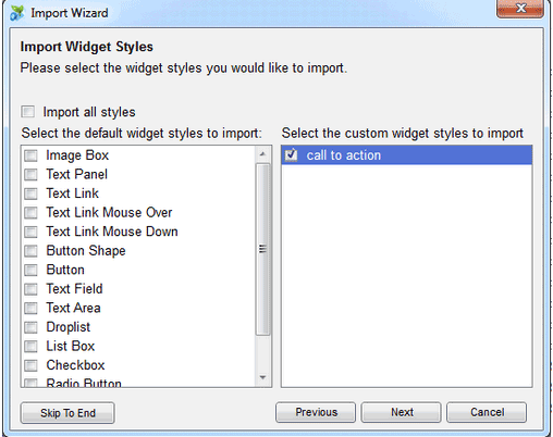
Click next, next, next, til you get to click finish.
Your style will now have been updated in your RP file, with the button text left aligned across all instances, I can now go and resize the button on the other pages with the variant text, making it look nice. So, by using styles, we can maintain formatting across instances, whilst adding variable content - not something masters were designed for.
If we wanted to update our icon, which is a Master, we would need to follow the same process of importing from RPs(or RPLIBs). Note you could do this directly in the RP, if you're not worried about maintaining an up to date RPLIB file.
How robust is our solution?
Let's say you build out your prototype with 40 pages, it gets signed off, and your designer comes back with designs for your button. Can we quickly apply design for a high fidelity prototype? Let's see. Go back to your RPLIB. Edit the style, and reimport the style.
For me this did highlight a few issues:
- The original shape was a rectangle - no rounded corners - I'd need to go through all the pages and change the shape type - not a huge issue - more human error.
- A bigger issue is a change to the font size/face/padding, i.e. a change to the width on the content. This would mean the width would need tweaking across the instances. The ability to toggle between inline & block behaviour for widgets, like in the CSS specification would be useful here i.e. the width of inline widgets would be flexible, determined by the content you input and padding.
A take away for me from this exercise was that different design assets require different solutions. There are 6 different ways of combining widgets, masters & styles (I'm not including different master types here, because a custom widget masters are effectively just library widgets, and placement in background isn't really relevant to the discussion):
- Widget
- Master
- Widget with Style
- Master with Style
- Library Widget with embedded Master components
- Library widget, with Master components & Style
So when creating an asset you must think about how you want to deploy that asset. Every asset is different, and every team has different ways of working, and different projects. I would say experimentation is most important. I have, however, attempted to make some generalisations.
Library widgets
Library widgets are widgets that you intend to deploy across projects, and are editable. That's not to say it shouldn't include components or properties that will remain identical across the project. Library widgets are the most flexible because it allows us to edit the asset whilst maintaining consistent formatting using Style, whilst including components that remain consistent using Masters.
Masters
Masters are for design assets that don't change across the project. I find there aren't many content level patterns that don't require a little modification across the project, because stakeholders often like to see real content. Icons, are one for masters. Larger page level elements, like headers menus and footers are best deployed as masters. Using advanced page events and variables we can do things such as indicate the current page, and load appropriate submenus.
Style
Where we want an object's dimensions to be flexible across instances of a like object, we can use Style to affect design, as demonstrated by our CTA button above. I also use style for applying a conceptual colour scheme early on. By using naming conventions like 'background', 'foreground panel' 'action colour' - colour is an important part of conveying meaning and hierarchy - Styles allow me to do this conceptually, usually in gray scale. Later on we can apply colours after it's been past the visual design people. Styles are less useful when you are working with just boxes and arrows, and don't plan to go far beyond this.
Widget libraries vs Masters
There's are often questions about the benefits of using a widget library over masters, and vice versa. There isn't a huge difference. Most of what can be achieved with library widgets can be achieved by masters by invoking the custom widget behaviour in a master. For me the benefits in using a widget library lie in the ability to organise better.
By having a widget library you can indicate that library widgets are top level objects, and masters are components of these objects. This give users of the library more guidance about how to use your design assets.
Organisation-wise masters do allow you organise with a folder structure - which is definitely a one-up on libraries - but you can create multiple libraries for delineating assets, and browsing libraries is much easier with the thumbnails (be great if we could blow these up Axure people!) Update - Axure 7 has folders for libraries.
Another thing I like about using Masters as a component store for a library is that only the required masters are imported to the RP from the RPLIB when you drag library widgets into the project. You don't have superfluous masters hanging around in the project file. The masters are a clear specification of unique assets that need to designed/coded up. Combined with the masters usage report it makes life much easier for reviewers, coders & designers.
One final point is future proofing. Widget libraries we created for the purpose of browsing and placing design assets in the project, whereas masters store assets which will remain the identical across the project. We don't know about how Axure will change in the next release, but if you want your asset management to be future proofed, using a widget library may be the better way to go...
Learning Axure RP 7 video course.

My video course on Axure RP 7 was finally published on the 30th January 2015 by Packt publishing, called Learning Axure RP 7.
About a year's work yielded a 4 hour and 17 minute epic. It's great value for money! Go buy it from the Packt site today..